

Ecommerce Checkout Page Best Practices That Convert
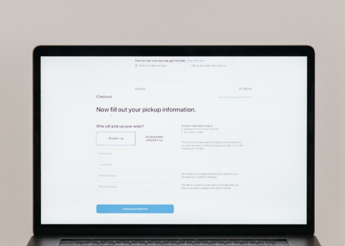
A strong checkout page removes doubt, reduces effort, and helps shoppers finish the order they already want to place. If you’re improving revenue from your store, checkout optimization is one of the highest-impact places to look because it directly affects cart abandonment rate, payment completion, trust, and repeat purchase potential.
For stores working on both traffic and conversion, services like ecommerce seo ohio can fit into the same growth plan: bring in better shoppers, then make checkout easier for them to complete.
Start by finding where shoppers drop off
Before changing buttons, forms, or payment options, look at the checkout funnel. Your cart abandonment rate tells you how many shoppers add products but leave before buying. Segment that data by device, traffic source, shipping region, payment method, and new versus returning customers.
A mobile shopper leaving on the shipping step may have a different problem than a desktop shopper leaving after seeing tax and delivery costs. The goal is not just “make checkout shorter.” The goal is to remove the specific friction that stops your customers.
Reduce checkout form fields
Every unnecessary field gives shoppers another reason to pause. Ask only for information needed to complete the order, prevent fraud, or support delivery. A typical checkout should not force users to create an account, enter duplicate address details, or answer marketing questions before payment.
Use autofill, address lookup, clear error messages, and smart defaults. If billing and shipping addresses are the same, let shoppers check one box instead of filling everything twice. Form field optimization is especially important on mobile, where typing is slower and mistakes are easier.
Guest checkout should be the default for first-time buyers. You can still invite shoppers to create an account after purchase, when the order is complete and the pressure is gone.
Be upfront about shipping costs
Surprise shipping costs are one of the fastest ways to lose trust. Show estimated shipping, taxes, delivery windows, and return information before the final payment step whenever possible.
Shipping cost transparency does more than reduce abandonment. It tells shoppers you are not hiding fees until the last second. If your store offers free shipping thresholds, show progress clearly in the cart and checkout. For example, “You’re $12 away from free shipping” is more helpful than making the shopper hunt for a policy page.
Trust signals also matter here. Secure payment badges, accepted payment logos, return policy links, customer support access, and clear order summaries all help shoppers feel safe continuing.
Design checkout for mobile first
Mobile responsiveness is not just about fitting the page onto a smaller screen. A mobile-first checkout uses large tap targets, short forms, simple progress indicators, sticky order summaries where appropriate, and payment options that work well on phones.
Digital wallets can be especially useful on mobile because they reduce typing. Apple Pay, Google Pay, Shop Pay, PayPal, and region-specific payment methods can all reduce friction when they match your audience. The right payment gateway integration should support your customer base, not just the default options your platform shipped with.
For international stores, multi-currency, multi-language support, local payment methods, and localized address formats can make checkout feel familiar instead of risky.
Personalize without getting creepy

Checkout personalization works best when it helps the shopper complete the order. Returning customers can see saved addresses, preferred payment methods, and loyalty points. Wholesale customers might need purchase order fields or net terms. First-time customers may need more reassurance around returns and delivery.
AI-driven checkout assistants can help answer last-minute questions about sizing, delivery timing, promo codes, or returns. Keep them helpful and optional. If an assistant blocks the page, distracts from payment, or gives uncertain answers about policies, it can create more doubt than confidence.
Promo code fields deserve careful handling too. A large empty coupon box can send shoppers away to search for discounts. A smaller “Have a code?” link keeps the option available without making full-price shoppers feel like they are missing something.
Use checkout to support retention
The checkout page should close the sale, but the order confirmation flow can start the next relationship. After payment, invite customers to create an account, join a loyalty program, track the shipment, subscribe to replenishment reminders, or save preferences for next time.
This is where customer lifetime value starts to grow. Do not overload the confirmation page with five offers. Choose one useful next step based on the order. A skincare store might suggest a refill reminder. A fashion store might invite the customer to save sizes. A B2B store might offer invoice downloads and reorder tools.
Prioritize improvements by business scale
Small stores should start with the basics: guest checkout, fewer fields, transparent shipping, mobile usability, and trusted payment options. These changes usually require less complexity and can quickly reduce obvious friction.
Growing stores should add better analytics, A/B testing, payment method expansion, abandoned cart recovery, and checkout personalization by customer segment. At this stage, small conversion gains can be worth a lot because order volume is higher.
Enterprise stores should focus on deeper payment gateway integration, fraud controls, localization, checkout speed, AI support, and post-purchase retention flows. The risk here is complexity. Every new feature should earn its place by improving completion, trust, or customer lifetime value.
Final checkout optimization checklist
A high-converting checkout is clear, fast, trustworthy, and built around how your customers actually buy. Start with your funnel data, remove unnecessary fields, offer guest checkout, show costs early, design for mobile, support preferred payment methods, and use the post-purchase moment to build retention.
The best checkout page does not feel clever. It feels easy. That is exactly why it converts.