The Complete Guide to Choosing the Perfect Wallpaper for Any Room
The Complete Guide to Choosing the Perfect Wallpaper for Any Room
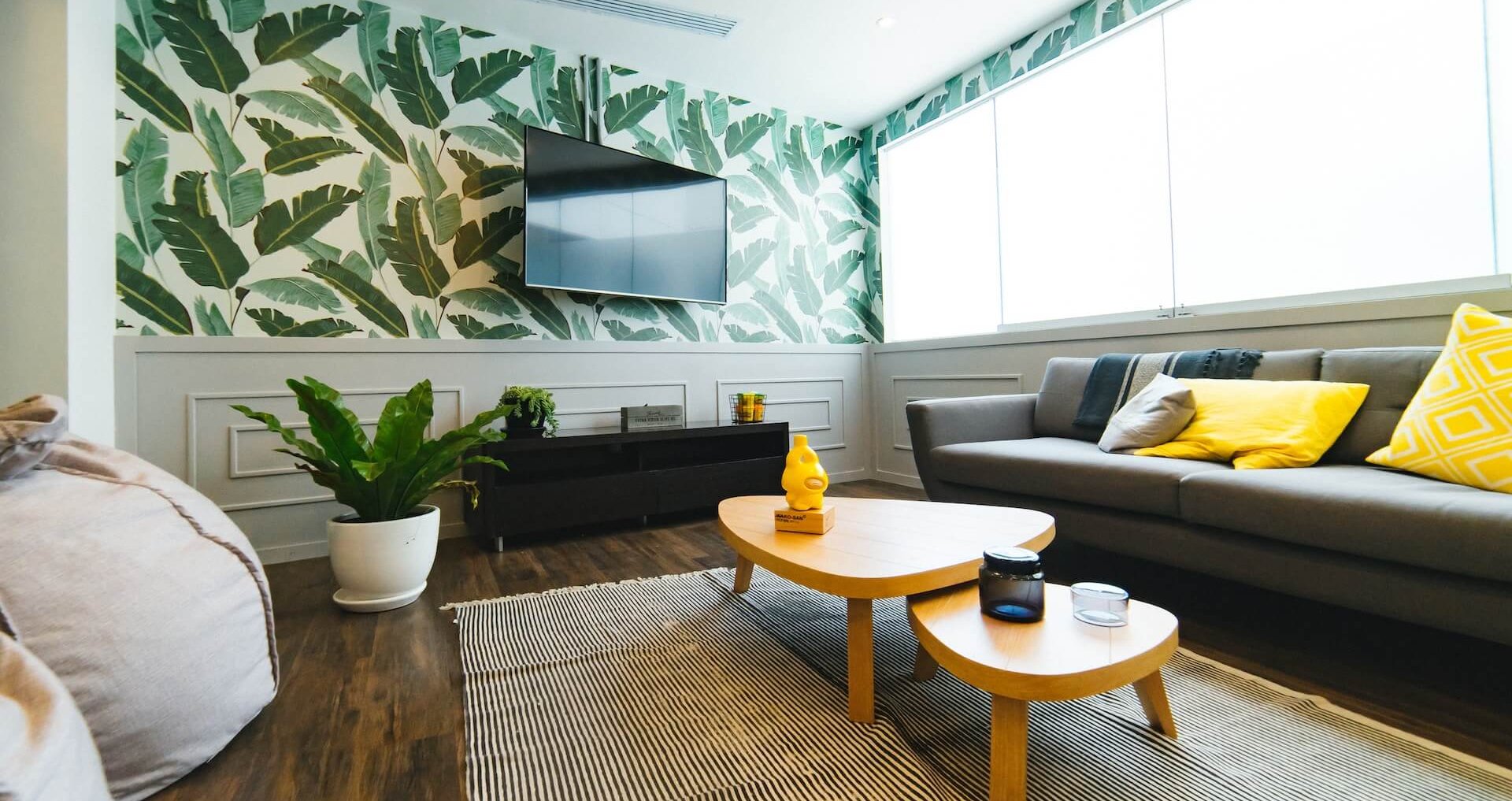
Universal wallpaper is about discovering a thread that quietly connects every corner of your home, no matter how the furniture shifts or the sunlight falls.
Choosing the perfect wallpaper for any room by wandering in the wallpaper online store—this question is so much richer than “which color hides coffee stains?” or “what would granny approve?” (though, bless her floral-loving heart). You’re looking for something with soul—universal, yes, but not flat or soulless. Something that would feel at home in a bedroom, office, or hallway, yet still whispers a quiet kind of poetry.
Material Matters (But Don’t Let It Rule Your Heart)
Vinyl is the workhorse—it’s washable, durable, and forgiving of life’s little mishaps. But don’t let practicality alone box you in. There are wonderful non-woven wallpapers too, which are breathable, easy to hang, and feel a bit more “natural.” The point is: pick a material that fits your life, not just your mop and bucket.
You need to be cautious here! Not all vinyl wallpapers are created equal. There are two main types:
- Solid vinyl: Durable, washable, and often used in kitchens/bathrooms. The downside? Cheaper versions can off-gas (release VOCs) and sometimes have that “new shower curtain” smell.
- Vinyl-coated paper: Has a thinner vinyl layer over paper—less plasticky, more breathable, but still easier to clean than pure paper.
Safety Check
Look for wallpapers labeled “phthalate-free” or “low-VOC.” European and North American brands usually adhere to stricter safety standards and often carry certifications like:
- Greenguard Gold
- CE Mark (Europe)
- RAL (Germany)
If you can’t touch or sniff before buying, check for these certificates in the product description or reach out to the seller for a Material Safety Data Sheet (MSDS). Trust your nose—if it smells weird out of the box, it probably won’t get better on your wall, even with time!
The Art of the “Quiet Pattern”
Universal doesn’t have to mean boring! Soft pastels, gentle textures, or even a subtle geometric can be incredibly versatile. Think of patterns inspired by linen, grasscloth, or tiny, almost-impressionistic motifs. These add depth and light movement to a room but don’t shout for attention. They play well with every kind of furniture, from modern to antique so no need to worry about matching.
But, here’s a deal! Low-light corners can turn even the loveliest subtle pattern into a muddy patch. Here’s a trick:
- Go a shade lighter in shadowy rooms
- Choose patterns with a hint of sheen (like silk-effect or pearlescent finish) to bounce what little light there is.
- And texture helps here! It reads as intentional, not like a manufacturing oops.
Scale and Repeat—A Designer’s Secret
Large, bold patterns can be stunning, but they lock you into a certain vibe—and they’re tricky to line up. For universal appeal, go for a small-scale or “random match” pattern. These designs don’t require perfect alignment, so they’re easier to install and look seamless, even if your walls are less than straight (old houses, I see you!).
Patterns labeled “random match” or “free match” are your friend—no stress about lining up motifs, and any seams are basically invisible, even for DIYers.
Butt Joints: Design or Thickness?
Both matter! Thicker wallpapers (like non-woven or fabric-backed vinyls) are more forgiving—less likely to “gap” or show seams. Yet, subtle patterns or solid colors hide joints best—high-contrast, geometric, or metallic prints will betray any misalignment.
Pro tip: Look for the phrase “butt join installation” or “seamless finish” in the product info. And, any reputable manufacturer should list thickness (in gsm or mm), installation style, and, ideally, air quality certifications.
The Color Chameleon
A versatile wallpaper is like a great pair of jeans—it works with anything. Soft greys, warm taupes, muted blues, or gentle green-greys all have that chameleon quality. They change mood depending on the light and what you pair with them. Not quite beige, but not a “statement wall” either.
Mix & Match
Alternating two tones (think: soft taupe + pale sage or misty blue + warm gray) can create movement and a gentle “rhythm,” especially as the light changes. Vertical stripes can stretch a room’s height; alternating panels can widen a narrow space. It’s like jazz for your walls—subtle, but with a groove.
Texture Is Your Friend
Sometimes, the most universal design isn’t a pattern but a feeling. Textured wallpapers—think grasscloth, silk-effect, or even faux concrete—add dimension without dominating a room. They’re quietly luxurious and play nicely with art, bookshelves, or even your granny’s crocheted doilies.
For example, modern silk-effect wallpapers (often non-woven or vinyl-backed) are designed to look luxe but be practical.
- Quality check—The best have a slight shimmer (not glittery), feel smooth but not plasticky, and are labeled “washable” or “scrubbable.”
- Dust—Textures that are too deep can catch dust, but most silk-effects are smooth enough to wipe gently with a dry microfiber cloth. Avoid ones with heavy embossing if dust is a big worry.
The Unexpected Classic
If you want a little edge but still crave versatility, consider a soft herringbone, a micro-dot, or even an abstract watercolor wash. These designs are subtle enough to suit any space, but have just enough personality to keep things interesting—like the wallpaper equivalent of a wink.
Every wallpaper is a little adventure in texture, light, and mood. Think of your walls as poetry—sometimes you want a bold stanza, sometimes a gentle haiku. Trust your senses, check those certificates, and don’t be shy to request a sample if you can. (Many shops will mail you a swatch for a small fee or even for free.)
Reframing Your Wallpapering Mission
Think in Atmospheres, Not Just Colors
Ask yourself: What’s the emotional climate I want to create in my home? Is it calm, uplifting, grounded, subtly joyful?
Universal wallpaper is less about a single “look” and more about a feeling that flows from one space to another—a sort of visual harmony, like a melody you can hum in any key.
Embrace the Power of Texture
Consider that sometimes the most “universal” design isn’t a pattern but a texture—something you feel more than see. A gentle linen weave, a soft pearlescent shimmer, or a barely-there brushstroke. These don’t demand attention, but they quietly elevate every room, like the reassuring weight of your favorite sweater.
Let Light Be Your Co-Designer
Instead of worrying about how a wallpaper performs in shadow or sunlight, imagine yourself as a painter, letting natural light do half the work. Choose something that changes character as the day shifts—matte in the morning, glowing at golden hour, serene at night. The right wallpaper can make your home feel alive, never static.
Invite a Sense of Movement
Patterns with a slight, organic flow (think: gentle ripples, subtle waves, or abstract botanicals) can create a feeling of continuity—like a gentle breeze that moves from room to room. It’s not about matching, but about echoing a rhythm walking throughout your space.
See It as a Canvas, Not a Finished Painting
The wallpaper isn’t the star; it’s the backdrop for your art, your photos, your favorite reading nook, and that odd little lamp you found at a flea market. Think of it as an invitation for your life to unfold, not a statement that overshadows it.