What is a Stock Heatmap, and How Can It Improve Your Trading Decisions?
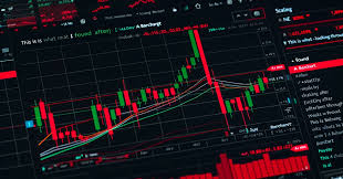
Markets move fast. Traders don’t just need information, they need structure. They need to understand where the movement is and why it matters. That’s where a stock heatmap comes in. It’s not a complex algorithm or a high-frequency tool. It’s a clear, visual display of what the market is doing now.
This tool is more than useful for anyone serious about refining their strategy.
What a Stock Heatmap Shows
A stock heatmap is a visual layout in which each block represents a listed company. The size of each block reflects the company’s market cap, and the color signals the direction and magnitude of the price change. Green means the stock is up, and red means it’s down. The deeper the color, the stronger the move.
But the actual value doesn’t lie in individual blocks. It’s in what happens when you look at them together.
Patterns emerge. Entire sectors light up green or bleed red. One glance and you begin to see where capital is flowing or fleeing. That’s the kind of information that makes a difference before you even open a chart.
Why Traders Use a Heatmap Before Making a Move
Traders often discuss momentum, sector strength, and market breadth. A heatmap allows them to measure those concepts without digging through data pages.
Let’s say you’re preparing for the trading day. You have 20 names on your watchlist. Before you look at any of them, you scan the heatmap. You see that energy stocks are up while tech is mixed. That instantly gives you context. It doesn’t tell you what to trade, but it tells you where to focus.
That’s how good decisions begin: with the proper perspective.
How a Stock Market Map Sharpens Your Focus
The stock market map arranges companies by sector, so it’s easy to see how different industries behave relative to one another. Are banks rising while healthcare stalls? Are defensive sectors gaining ground while cyclical sell-offs occur?
These relationships give insight into broader trends. If you see consistent green in consumer discretionary and tech, you’re likely looking at a market with growing risk appetite. If utilities lead while other sectors cool, caution may be set in.
Charts can confirm setups. The map tells you where those setups are more likely to work.
The Role of the SP500 Heatmap in Market Assessment
Among all heatmaps, the SP500 heatmap is one of the most widely used and for good reason. It covers the most influential companies in the U.S. economy. These names don’t just respond to market sentiment. They shape it.
Watching how sectors perform within the S&P 500 gives you a sharper read on market internals. For example, if large-cap tech is down but financials are flat or green, the market may not be as weak as it looks. This kind of insight helps traders stay level-headed when price action seems confusing.
How the Heatmap Fits Into a Trading Routine
There’s no single formula for using a heatmap, but most experienced traders follow a rhythm that anchors their daily decisions. They scan the market at the open to see which sectors are gaining early momentum or showing signs of weakness. This gives them a read on where attention is focused right out of the gate.
As the day unfolds, they revisit the heatmap around midday to check whether those early moves are holding steady or starting to fade. Sometimes what looks like strength in the morning turns into indecision by noon, and the heatmap helps spot that shift quickly.
Toward the close, they assess where leadership ultimately settled. Did specific sectors maintain control? Did new ones emerge? Reviewing this end-of-day structure helps shape expectations for the following session and reveals whether a real trend is forming or if the market remains fragmented.
This routine doesn’t replace chart work. It enhances it. You must still study entries, manage risk, and track price behavior. But with a heatmap guiding your focus, you approach that analysis with sharper filters and stronger context.
A Tool That Keeps You Grounded
When markets are volatile, it’s easy to get caught chasing names moving without direction. A heatmap helps you slow down. It keeps you grounded in what’s real: sector momentum, correlated strength, and broad participation.
Over time, this visual tool will sharpen your instinct for recognizing when a move weighs in, and when it doesn’t.
Seeing the Whole Before You Act on the Parts
A heatmap won’t tell you what to buy. It won’t give you entry signals or price targets. But it will tell you where the action is, where sentiment is shifting, and which sectors deserve your attention.
That’s how better trades begin with a better view of the field.