The Best Online Photo Editors for Filters and Text in 2026: What’s Actually Worth Your Time
Introduction
Most people don’t need a professional photo editor — they need a fast, intuitive web app that lets them apply a filter, drop in some text, and export a polished image without a tutorial or a subscription to software they’ll use twice a year. The problem is that the online photo editing space in 2026 is crowded with tools that promise simplicity but deliver frustration, or that bury the most useful features behind paywalls and cluttered interfaces. The good news is that a handful of genuinely excellent browser-based editors have emerged that make quick, high-quality photo editing accessible to anyone. This guide walks you through the features that matter, the tips that will improve your results immediately, and the tools most worth your time in 2026.
Why the Right Online Photo Editor Changes Everything
There’s a meaningful difference between a web app that technically lets you edit photos and one that makes the process feel easy, fast, and repeatable. The best browser-based photo editors in 2026 have closed the gap with desktop software in ways that matter for everyday use: real-time filter previews, AI-powered adjustments, layer support, and seamless export to platform-specific dimensions. They run in any browser, update automatically, and don’t require you to manage files across multiple devices.
For content creators, small business owners, educators, marketers, and casual users alike, this shift has real practical value. A well-chosen web app means you can go from raw photo to publish-ready image in under five minutes — on a laptop, a tablet, or a borrowed Chromebook — without compromising on quality. The key is knowing what to look for before you commit time to learning any particular tool, and understanding the editing principles that apply regardless of which platform you use.
The sections below cover both: a set of platform-agnostic tips that will improve your editing across any tool you choose, plus specific guidance on features and workflows that separate the best web apps from the ones that will slow you down.
What Separates a Good Online Photo Editor from a Great One
Before diving into tips, it’s worth being clear about the criteria that define a truly user-friendly online photo editor in 2026. Not all tools are built with the same priorities, and understanding what to evaluate will help you choose the right one for your specific use case.
Features that define a genuinely user-friendly web editor:
- Live filter previews: The tool shows you how each preset will look on your specific image before you commit — no apply-and-undo trial and error
- Accessible text controls: Font, size, color, alignment, opacity, and effects like shadows and outlines are visible and adjustable without navigating nested menus
- Non-destructive editing options: Adjustments can be changed or removed after the fact rather than being permanently baked into the image
- Performance on standard hardware: The editor runs smoothly on mid-range devices, not just high-end workstations
- Meaningful free tier: Core features — filtering, text, basic adjustments, and full-resolution export — are available without payment
- Platform-size presets: The tool knows the correct dimensions for Instagram, LinkedIn, Facebook, and other common publishing destinations
- Template library: Pre-built layouts give users a starting point that reduces the blank-canvas barrier for non-designers
With those criteria in mind, here are ten practical tips for getting the most out of any browser-based photo editor.
10 Tips for Better Results with Online Photo Editors
Tip 1: Correct Your Exposure Before You Touch a Filter
Filters are a creative choice, not a repair tool. A stylistic preset applied to a poorly exposed or color-imbalanced image doesn’t fix the underlying problem — it amplifies it. A high-contrast filter on an overexposed photo destroys the highlights permanently. A desaturating, moody filter on an underexposed image turns it dark and murky. If you’ve ever applied a filter and felt like something was still off without being able to name what, this is almost always the reason.
The fix takes less than a minute in any decent web editor. Before opening the filter panel, go to the basic adjustments section — usually labeled “Edit,” “Adjust,” or “Corrections” — and address the fundamentals. Lift shadows slightly if the image looks flat. Pull highlights down if bright areas are washed out. Nudge the white balance if there’s an unwanted warm or cool color cast. Adjust contrast if the image looks either milky or overly harsh.
Once your baseline is clean, filters will behave as intended: adding mood and style to a solid foundation rather than fighting against technical problems. You’ll also find that you need far less filter intensity to achieve the effect you’re after, which produces more natural, less processed-looking results.
Pre-filter correction checklist:
- Brightness is in a natural, balanced range
- Shadow areas have visible detail and aren’t crushed to black
- Highlights aren’t blown out or washed white
- White balance looks neutral (or intentionally warm/cool)
- Image is sharp — confirm at 100% zoom before editing
Tip 2: Use Adobe Express for a Professional All-in-One Editing Workflow
One of the strongest browser-based editors available in 2026 is Adobe Express, which manages the difficult balance between accessibility and professional output quality better than almost anything else in the category. It’s designed for users who need polished, publish-ready results without the learning curve of advanced software — and it delivers on that promise across photo editing, graphic design, and short-form video in one unified workspace.
For filter and text workflows, the platform offers one-click effects with live previews, a large library of licensed typefaces, and text animation options that require no technical skill to use. Its AI-powered tools — background removal, generative fill, and object erasing — all operate within the same canvas where you’re building your design, which keeps the workflow tight and eliminates the need to move between applications. The full suite of these capabilities is available through the photo editor, and it handles everything from a quick social post to a polished branded marketing asset with equal ease.
The free tier is substantive rather than just a demo. The paid plan adds premium assets, a brand kit for saving your fonts and colors, expanded AI tool credits, and higher export resolution — giving the platform a genuine growth path as your needs become more demanding.
Key features worth exploring:
- One-click background removal with reliable edge detection
- Thousands of licensed typefaces through Adobe Fonts
- Animated text presets for Stories and short-form video
- Brand kit for consistent color and font application across projects
- Resize-for-platform tool that adapts one design to multiple format dimensions instantly
Tip 3: Match Your Filter Choice to Your Subject Matter
Applying any filter at any intensity to any photo produces results that range from excellent to actively harmful, depending on the fit between the filter’s color logic and the subject matter of the image. Understanding why certain filters work on certain types of photos — and not others — gives you a reliable framework for making faster, better filter decisions.
Landscape and architectural photography is highly tolerant of strong, stylistic filters. The blues, greens, browns, and grays in natural and built environments handle significant color manipulation without triggering the same visual alarm bells that affected skin tones or food colors do. Portrait photography is the most filter-sensitive category: human eyes are wired to detect even subtle shifts in skin tone, and filters that look stunning on a cityscape can make a face look sallow, gray, or unnaturally saturated. Food photography occupies a similarly sensitive middle ground, where warm, slightly brightened treatments enhance appetite appeal and cool, desaturated ones destroy it.
Use this as a general working framework:
- Portraits and headshots: 15–40% intensity; avoid heavy desaturation, teal shadows, or anything that shifts skin into orange or gray
- Food and product photography: 10–25% intensity; prioritize subtle warmth and brightness enhancement over stylistic effects
- Landscape, travel, and architecture: 40–75% is often appropriate; these subject types tolerate strong processing
- Social graphics with significant text: Minimal or no filter — text legibility must take priority
- Events and lifestyle images: 30–55%; warm, slightly faded film-style treatments tend to work well
Tip 4: Build a Two-Font Text System for Every Design
Typography is where casual photo editing most visibly diverges from professional design, and the solution is simpler than most people expect: use a maximum of two fonts per design, establish a clear size and weight hierarchy between them, and apply that system consistently. This single constraint eliminates most of the typographic problems that make text-on-photo designs look unresolved.
The logic behind the two-font rule is hierarchy. One font carries the attention-getting role — headline, call to action, primary message — and should have enough visual personality or weight to stop the eye. The other font handles supporting information and should be clean, neutral, and highly readable at smaller sizes. The contrast between these two roles is what creates the sense of order that makes a design feel intentional rather than assembled.
Many browser-based editors offer font pairing suggestions or pre-matched combinations within their template systems — use these as starting points, especially if typography isn’t a primary area of confidence. Avoid the trap of browsing the full font library every time; choose two fonts you trust, test them together, and use them consistently across a project. The second, equally important rule is contrast between text and background. A drop shadow at 30–50% opacity, a semi-transparent fill behind the text block, or a localized darkening of the image in the text zone are all reliable techniques for ensuring legibility across varying background complexity.
Typography checklist for text-on-image:
- Maximum two font families per design
- Clear size or weight distinction between headline and supporting text
- Test legibility at thumbnail size, not just full resolution
- Use shadow, overlay, or background fill on complex or variable backgrounds
- Avoid placing text directly over the main subject of the photo
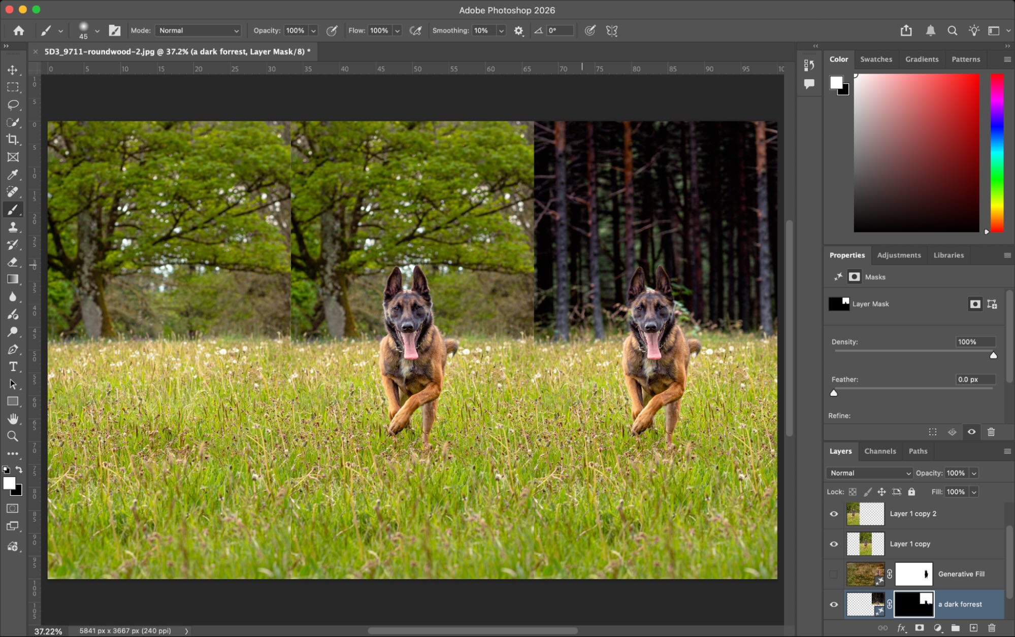
Tip 5: Remove Backgrounds Before Adding Text or Filters
One of the most efficient workflow changes available in 2026’s web editors is using AI background removal as a first step — before adding text or applying filters — rather than treating it as a finishing touch. Removing a complex or visually busy background simplifies the image immediately, creates natural negative space where text can be placed cleanly, and often makes subsequent filter application more consistent because the filter is working on a simpler, more controlled image.
The technology behind one-click background removal has matured substantially. Edge detection around hair, fabric, and semi-transparent objects is reliable enough for professional use on most standard images. Once the background is removed, you have full control over what replaces it: a solid brand color, a gradient, a subtle texture, or pure transparency for export as a PNG that can be placed on any surface.
For promotional graphics, product showcases, and event announcements where text plays a central role, this workflow consistently produces cleaner results than searching for a quiet corner of a complex background to place type. Instead of working around compositional constraints, you’re building on a surface you’ve intentionally designed — which transforms text placement from a compromise into a deliberate creative decision.
Tip 6: Use AI Filter Recommendations to Navigate Large Preset Libraries
The filter library problem is real: a tool that offers 200 presets is technically giving you more options, but in practice it creates paralysis. Scrolling through hundreds of tiny thumbnail previews, many of which look nearly identical until you apply them at full size, can easily consume more time than every other part of the editing process combined.
Several leading browser-based editors now address this with AI-powered filter recommendation systems. After uploading an image, the tool analyzes its content — identifying whether the photo is a portrait, landscape, food shot, architectural image, or something more abstract — and surfaces a curated shortlist of presets most likely to work well for that specific image type. The recommendation draws on how filters have historically performed on images with similar tonal distributions, subject matter, and color relationships.
When this feature is available in your editor, use the recommended shortlist as your starting point and explore outward from there rather than starting with the full library. The suggestions won’t always be exactly right, but they’ll almost always get you into the right filter family, from which point fine-tuning intensity and exploring adjacent presets is fast and focused. This approach is especially efficient when editing a batch of similar images, where consistent filter treatment across the set matters as much as the quality of any individual image.
Tip 7: Save and Reuse a Core Color Palette Across Projects
The visual difference between a set of photos that looks designed and one that looks assembled almost always comes down to color consistency. When every image in a series uses slightly different text colors, background tones, and graphic accent colors, the set feels visually random even when each individual image looks acceptable in isolation. A defined color palette, applied consistently across a project, is what creates the sense of cohesion that signals professional intent.
Before starting any project that involves multiple images, identify four to six hex color values that will serve as your consistent palette: a primary color, a secondary, one or two neutrals, and one or two accent tones. Most browser-based editors allow you to save custom color swatches within their color picker interface — use this feature to store your palette and reference it consistently rather than eyeballing color choices each time.
For filter consistency, the equivalent discipline is selecting one or two preset families and applying them at roughly the same intensity level across all images in the project. Over time, a consistent filter style becomes a visual signature — audiences begin to associate a particular look with your content. This is the same principle that makes editorial photography feel coherent across an entire publication even when subjects, locations, and photographers vary: the consistent processing style creates the visual through-line.
Steps to build a project color system:
- Choose 4–6 hex colors before opening your first image
- Save them as custom swatches in your editor’s color picker
- Select a primary filter preset and test it on two or three representative images
- Lock in your font pair for the project
- Export a sample grid of three or four images together to verify consistency before continuing
Tip 8: Apply Filters Regionally, Not Just Globally
Most beginning and intermediate editors apply filters globally — one preset at one intensity level across the entire image. This approach works adequately in many cases, but it produces noticeably better results when you have the option to apply adjustments selectively to specific regions of the image rather than treating every part of the frame identically.
Regional adjustment tools — sometimes called selective color, masking, or local adjustments, depending on the editor — let you brighten a shadow area without blowing out already-bright regions, warm the skin tones in a portrait without shifting the background color, or add contrast to a flat sky without affecting the foreground. More advanced browser-based editors, particularly those with layer or masking support, make this kind of targeted editing accessible without requiring deep technical knowledge.
Even without a full masking system, many web editors include a “portrait” or “face” adjustment tool that automatically detects skin tones and allows you to adjust them independently from the rest of the image. For portraits and lifestyle photography, this single feature can make the difference between a filter that looks great and one that looks like it was applied by software.
Tip 9: Export for the Platform, Not for the Archive
Export settings are where carefully edited images can be quietly undermined. Using the wrong dimensions, file format, or compression level for a given publishing platform leads to pixelated thumbnails, oversized uploads, slow page load times, or colors that shift between your editor preview and the published result.
The most efficient approach is to use your editor’s platform-size preset system wherever it’s available — these presets encode the correct dimensions, aspect ratios, and export settings for each major platform and remove the need to remember or manually enter technical specifications. When presets aren’t available, use the following as a working reference:
- Instagram feed (square): JPEG, 1080 × 1080px, quality 85–95%
- Instagram feed (portrait): JPEG, 1080 × 1350px, quality 85–95%
- Instagram Stories / Reels cover: JPEG or PNG, 1080 × 1920px
- LinkedIn company banner: PNG, 1128 × 191px (PNG preserves sharp text edges)
- Website hero images: WebP preferred, 1920px wide, under 300KB
- Email header graphics: JPEG, 600px wide, file size under 150KB
- Printed materials: PNG at maximum resolution; confirm DPI requirements with your print provider
One frequently overlooked detail is color profile. Most web editors default to sRGB, which is correct for screen display. If you’re exporting for professional print production, confirm whether the print provider requires CMYK files — some browser-based editors support CMYK export, but many do not, which may require an additional conversion step.
Tip 10: Build Personal Templates for Recurring Content Formats
If you edit photos for any kind of recurring content — weekly social posts, regular product updates, event announcements, newsletter graphics, blog headers — rebuilding the same design from scratch each time is both time-consuming and a reliable source of inconsistency. The more efficient approach is to build a personal template for each recurring format once, save it, and use it as your starting point every time.
A template in this context doesn’t mean a rigid, locked design. It means a saved file that already has your dimensions, background treatment, font selections, color palette, and standard text placement zones set up — so when you open it for a new piece of content, you’re making content decisions (which photo to use, what the text says) rather than structural decisions (where does the text go, which font is this, what color is that element). The time investment in building the template pays back within a few uses.
Most browser-based editors let you duplicate previous designs and use them as starting points for new content. Make this a consistent habit. Over time, your workflow gets faster, your output gets more consistent, and your content develops a visual coherence that audiences begin to recognize — which is ultimately the purpose of having a visual content workflow in the first place.
FAQ: Online Photo Editors for Filters and Text in 2026
Q1: What should I look for in an online photo editor if I have no design experience?
For someone with no design background, the three features that matter most are a live filter preview system, an intuitive text tool, and a solid template library. A live filter preview shows you exactly how each preset will affect your specific image before you apply it, which removes the trial-and-error cycle that makes editing feel frustrating for new users. An intuitive text tool means font, size, color, and alignment controls are immediately visible and labeled clearly — not buried in expandable menus or accessible only through keyboard shortcuts. A strong template library gives you a professionally designed layout to start from rather than a blank canvas, which solves the intimidation problem that stops many beginners from producing anything at all. Prioritizing these three features will lead you toward tools that feel natural to use from the first session, and consistent use of any good tool will build editing instincts faster than switching between platforms looking for a perfect fit.
Q2: Are free online photo editors good enough for professional-quality output?
For the vast majority of professional use cases — social media content, website graphics, marketing materials, email headers, event promotions, and e-commerce imagery — the free tiers of leading browser-based editors are fully capable of producing output that looks polished, intentional, and publication-ready. The meaningful limitations of free tiers tend to fall into predictable categories: watermarks on exported images (always check this before committing to a tool), restricted access to premium fonts and design assets, lower maximum export resolution, and caps on AI-powered feature usage. None of these limitations prevent quality output — they define the boundaries within which quality output is achievable without payment. For workflows that require print-resolution exports, access to a large licensed asset library, or brand consistency tools like saved color kits and font presets, a paid plan becomes worthwhile. But the free tier of a well-chosen editor is a legitimate production environment, not just a preview of what you’d get if you paid.
Q3: How can I make text on photos look designed rather than just placed?
The gap between text that looks designed and text that looks like it was added as an afterthought almost always comes down to three factors: font discipline, placement logic, and contrast management. For font discipline, use a maximum of two fonts per design and make sure there’s a clear visual difference between them — one for headlines, one for supporting text. Resist the temptation to browse the full font library for every project; choose two fonts you trust, test that they work together, and apply them consistently. For placement, identify the visually quietest areas of the image — smooth sky, blurred background, a corner with consistent tone and low detail — and position your text there rather than over the main subject. For contrast, never rely on color choice alone to make text readable; use a drop shadow, a semi-transparent fill behind the text, or a localized darkening of the image in the text zone.
Q4: How do I keep a consistent look across a series of edited images?
Consistency across a series of images is achieved through decisions made before you start editing, not during. The most effective approach is to establish three things upfront: your filter preset (and the intensity at which you’ll apply it), your color palette (the specific hex values you’ll use for text, backgrounds, and accents), and your font pair. If you don’t already have a color palette, Coolors is a fast, free tool for generating harmonious color schemes and copying the exact hex codes — you can generate a palette in seconds and lock in your values before you open your photo editor. With these three variables locked in, your individual editing sessions become a process of applying a defined system rather than making fresh creative decisions on each image — which is both faster and dramatically more consistent. Store your color palette as saved swatches in your editor, use the same filter at the same intensity across every image in the set, and resist the urge to fine-tune individual images unless there’s a genuine technical problem. Reviewing a grid of your exports together before publishing is a reliable final check: inconsistencies that are invisible when images are evaluated one at a time become immediately obvious when they’re viewed side by side.
Q5: Is it safe to upload personal or sensitive photos to browser-based photo editors?
This is a more important question than most users ask, and the honest answer is: it depends significantly on which tool you’re using and what terms you’ve agreed to. Data handling practices vary substantially across browser-based editors. Reputable platforms publish terms of service specifying that they don’t claim ownership of uploaded content and that images are processed temporarily rather than retained permanently — but the definition of “temporary” and the specific conditions under which images may be used to train AI models vary between platforms and between free and paid account tiers. Free tier terms in particular sometimes include broader language than paid tier terms. Before uploading personal photos — especially images of minors, sensitive locations, confidential business content, or proprietary product photography — read the privacy policy specifically regarding image storage, retention duration, and AI training data practices. For genuinely sensitive material, a desktop-based editor that processes images locally without uploading to any server is the appropriate tool. For business use cases, enterprise plans at reputable platforms typically include explicit data processing agreements that provide stronger protections than consumer terms.
Conclusion
The browser-based photo editing landscape in 2026 offers genuine capability across every skill level and use case — from a first-time user adding text to a birthday announcement to a content team producing hundreds of branded assets each month. The tools available today have removed almost every technical barrier that once separated people with design skills from people with photos who needed to do something useful with them. What remains is the work of using those tools with intention: correcting your exposure before filtering, building a consistent typographic system, managing color across a series, and exporting with the right settings for each publishing destination.
The ten tips in this guide are designed to be platform-agnostic because the principles behind them — clean foundations, deliberate decisions, consistent execution — apply regardless of which specific editor you use. Start with one tool that meets the criteria outlined above, apply these workflow habits consistently, and you’ll find the gap between “photo I have” and “image I’m proud to publish” closing faster than you might expect.