AP Stats Unit 1 Review: Essential Notes & Tips 2026
AP Stats Unit 1 Review is the single most important starting point for any student preparing for the AP Statistics exam in 2026.
Unit 1 — officially titled Exploring One-Variable Data — covers topics 1.1 through 1.10 and makes up 15 to 23 percent of your entire AP exam score.
What Is AP Stats Unit 1 About? AP Stats Unit 1 Review
Unit 1 is titled Exploring One-Variable Data. It focuses on how to analyze and describe a single variable using graphs, numbers, and words.
The College Board assigns this unit a weight of 15–23% of the AP exam. That translates to roughly 7 to 11 multiple-choice questions and regular appearances on free-response questions throughout the test.
Every concept in Units 2 through 9 builds on what you learn here. If you can describe a distribution clearly and correctly, you will always have something meaningful to write on the AP exam.
Topic 1.1 — Introducing Statistics: What Is Data?
Statistics is the science of collecting, analyzing, and drawing conclusions from data.
In AP Stats, you need to understand why context always matters. The number 72 means nothing on its own. If it is a test score out of 100, it suggests above-average performance. If it is a heart rate, it is resting normal. Always connect numbers to their real-world setting.
The two major branches you need to know are descriptive statistics (summarizing what you have) and inferential statistics (drawing conclusions about a larger population from a sample).
Topic 1.2 — Types of Variables: Categorical vs. Quantitative
Every variable in AP Stats falls into one of two major categories.
Categorical Variables record which group or category an individual belongs to. Examples include gender, political party, blood type, and car brand. You cannot take a meaningful average of a categorical variable.
Quantitative Variables record numerical measurements that make arithmetic sense. Examples include height, test scores, temperature, and number of siblings. You can compute a mean for these.
| Variable Type | Examples | Can You Average? |
|---|---|---|
| Categorical (Nominal) | Blood type, eye color, car brand | No |
| Categorical (Ordinal) | Customer satisfaction rating, education level | No |
| Quantitative (Discrete) | Number of pets, siblings, touchdowns | Yes |
| Quantitative (Continuous) | Height, weight, temperature, time | Yes |
Nominal categorical data has no natural order. Ordinal categorical data has a natural rank but no consistent scale. Discrete quantitative data takes specific isolated values (whole numbers). Continuous quantitative data can take any value within a range.
Topic 1.3 — Representing One Categorical Variable
When you have a single categorical variable, you display it with a frequency table, bar graph, or pie chart.
A frequency table lists each category alongside its count and relative frequency (proportion). Relative frequency = count ÷ total.
A bar graph displays each category on the horizontal axis with bar heights representing frequency or relative frequency. Bars do not touch because categories are separate.
A pie chart shows each category as a slice proportional to its relative frequency. Use pie charts only when you want to emphasize how parts contribute to a whole.
The most common AP exam error with categorical displays is confusing a bar graph (categorical) with a histogram (quantitative). They look similar but serve completely different purposes.
Topic 1.4 — Representing Two Categorical Variables
When you have two categorical variables, you use a two-way table (also called a contingency table) or a side-by-side bar graph.
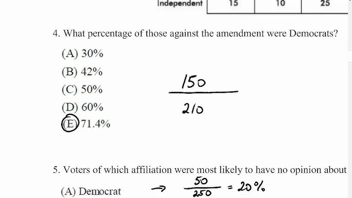
A two-way table organizes counts by cross-classifying two variables. Rows represent one variable, columns represent the other. Marginal frequencies appear in the row/column totals. Joint frequencies are the counts inside the table.
Conditional relative frequency is the key calculation here. It tells you the proportion within a specific group. For example, of students who prefer math, what proportion also prefer AP Stats?
The AP exam frequently asks you to calculate and interpret joint, marginal, and conditional frequencies from two-way tables. Practice all three.
Topic 1.5 — Representing Quantitative Data with Graphs
For a single quantitative variable, you have four main display options on the AP exam.
Dot Plots — Each data value is shown as a dot above a number line. Best for small datasets. Easy to see individual values and identify outliers.
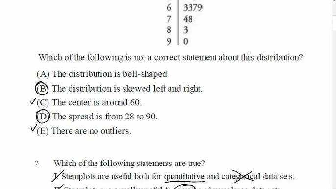
Stem-and-Leaf Plots — Splits each data value into a stem (leading digits) and leaf (last digit). Preserves all original data values. Back-to-back stem-and-leaf plots compare two groups.
Histograms — Groups data into equal-width intervals (bins) and displays bar heights as frequency or relative frequency. Best for larger datasets. Bars touch because quantitative data is continuous.
Cumulative Relative Frequency Plots (Ogives) — Plots the cumulative proportion of data at or below each value. Used to estimate percentiles and medians directly from the graph.
| Display | Best For | Preserves Data? |
|---|---|---|
| Dot Plot | Small dataset | Yes |
| Stem-and-Leaf | Small–medium, comparing two groups | Yes |
| Histogram | Large dataset, general shape | No |
| Ogive | Finding percentiles, median | No |
Topic 1.6 — Describing the Shape of a Distribution
Shape is always the first thing you describe when asked about a distribution. Use the SOCS framework in every description: Shape, Outliers, Center, Spread.
Symmetric — The distribution looks roughly the same on both sides of the center. A bell curve is symmetric. Mean ≈ Median.
Skewed Right (Positively Skewed) — The tail extends toward the right. Most data clusters on the left, with a few very large values pulling the distribution right. Mean > Median. Examples: income distributions, house prices.
Skewed Left (Negatively Skewed) — The tail extends toward the left. Most data clusters on the right, with a few very small values pulling the distribution left. Mean < Median. Examples: exam scores on an easy test, age at death.
Unimodal — One clear peak. Bimodal — Two peaks. Uniform — All bars roughly the same height.
The AP exam will test your ability to identify shape from a histogram, dot plot, or box plot and explain the relationship between mean and median based on shape.
Topic 1.7 — Measures of Center: Mean and Median
Mean is the arithmetic average. Add all values and divide by the number of values.
Mean formula: x̄ = (Σx) / n
The mean uses all data values, which means it is sensitive to outliers and skewness. A single extreme value can pull the mean significantly.
Median is the middle value when data are arranged in order. If n is even, the median is the average of the two middle values. The median is resistant to outliers because it only depends on position, not on the actual values of extreme data points.
When to use which:
- Use the mean when the distribution is roughly symmetric with no outliers.
- Use the median when the distribution is skewed or has outliers.
Mode is the most frequently occurring value. The AP exam rarely requires you to calculate mode, but you need to recognize unimodal vs. bimodal distributions in context.
Topic 1.8 — Measures of Spread: Standard Deviation and IQR
Spread describes how much the data varies. AP Stats uses two main measures of spread.
Interquartile Range (IQR) measures the range of the middle 50% of the data.
IQR = Q3 − Q1
The IQR is resistant to outliers, just like the median. Use IQR alongside median when data is skewed or has outliers.
Standard Deviation (s or σ) measures the average distance between each data value and the mean.
The formula for sample standard deviation: s = √[Σ(x − x̄)² / (n − 1)]
Standard deviation is not resistant — outliers inflate it significantly. Use standard deviation alongside mean when data is roughly symmetric with no outliers.
Range = Maximum − Minimum. Simple but highly sensitive to outliers. The AP exam rarely asks for range alone as a complete measure of spread.
| Measure | Resistant? | Use With |
|---|---|---|
| IQR | Yes | Median, skewed data |
| Standard Deviation | No | Mean, symmetric data |
| Range | No | Only for simple context |
A critical AP exam concept: always pair mean with standard deviation and always pair median with IQR. Mixing them is a common and penalized error on free-response questions.
Topic 1.9 — Five-Number Summary and Box Plots
The five-number summary captures the full spread of a quantitative distribution using five values.
Five-Number Summary: Minimum | Q1 | Median | Q3 | Maximum
Q1 (First Quartile) = median of the lower half of the data Q3 (Third Quartile) = median of the upper half of the data
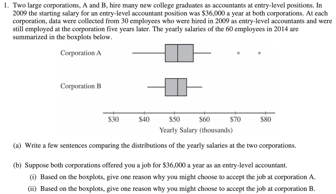
A box plot (box-and-whisker plot) displays the five-number summary visually. The box spans from Q1 to Q3. The median is a line inside the box. Whiskers extend to the minimum and maximum (unless there are outliers).
Outliers are plotted as individual points beyond the whiskers when a modified box plot is used.
The 1.5 × IQR Rule for Outliers:
Any value is an outlier if it falls:
- Below Q1 − 1.5 × IQR (Lower fence)
- Above Q3 + 1.5 × IQR (Upper fence)
Example: If Q1 = 54, Q3 = 65, then IQR = 11. Lower fence = 54 − 1.5(11) = 54 − 16.5 = 37.5 Upper fence = 65 + 1.5(11) = 65 + 16.5 = 81.5 Any value below 37.5 or above 81.5 is an outlier.
Box plots are especially useful for comparing two or more distributions side by side. Always comment on shape, center (median), and spread (IQR) when comparing.
Topic 1.9 — Percentiles and Cumulative Relative Frequency
A percentile tells you what percentage of data falls at or below a specific value.
If you score at the 80th percentile, that means 80% of the group scored at or below your score. Higher percentiles are better when higher scores are better, and vice versa for measurements like wait times.
Reading an Ogive (Cumulative Relative Frequency Graph):
- Locate the value on the x-axis.
- Read up to the curve and across to the y-axis to find the percentile.
- Reverse the process to find the value at a given percentile.
The median is always at the 50th percentile on an ogive. This is a quick way to estimate the median from a graph even when you cannot see the raw data.
Topic 1.10 — The Normal Distribution
The Normal Distribution is one of the most important concepts in all of AP Statistics. It appears in Unit 1 and connects directly to Units 5, 6, 7, 8, and 9.
A normal distribution is symmetric, bell-shaped, and described completely by its mean (μ) and standard deviation (σ). The peak is at the mean, and the distribution is symmetric around it.
The Empirical Rule (68-95-99.7 Rule):
- About 68% of data falls within 1 standard deviation of the mean (μ ± σ)
- About 95% of data falls within 2 standard deviations (μ ± 2σ)
- About 99.7% of data falls within 3 standard deviations (μ ± 3σ)
| Interval | Percentage of Data |
|---|---|
| μ ± 1σ | 68% |
| μ ± 2σ | 95% |
| μ ± 3σ | 99.7% |
This rule is tested directly on the AP exam almost every year. If a distribution is approximately normal with mean 79 and standard deviation 8:
- 68% of values fall between 71 and 87
- 95% of values fall between 63 and 95
- 99.7% of values fall between 55 and 103
Topic 1.10 — Z-Scores: Standardizing Values
A z-score tells you how many standard deviations a value is above or below the mean.
Z-score formula: z = (x − μ) / σ
A z-score of +2.0 means the value is 2 standard deviations above the mean. A z-score of −1.5 means the value is 1.5 standard deviations below the mean. A z-score of 0 means the value equals the mean exactly.
Why z-scores matter:
- They allow fair comparison between values from different distributions.
- They connect directly to percentiles using the Standard Normal Table (Table A on the AP exam).
- They let you determine how unusual any value is.
AP Exam Example: George Washington was 57 years old at inauguration, placing him at the 58th percentile. If σ = 7, what is the approximate mean age?
z at the 58th percentile ≈ 0.20 0.20 = (57 − μ) / 7 → 1.4 = 57 − μ → μ ≈ 55.6 ≈ 55 years
Inverse normal problems like this appear frequently. Practice working backward from a percentile to find z, then from z to find the raw value or mean.
The SOCS Framework: Your Most Important AP Exam Tool
The College Board explicitly expects you to describe distributions using SOCS in your free-response answers. This is the single most-tested skill in Unit 1.
S — Shape: Is it symmetric, skewed right, or skewed left? Unimodal or bimodal? Roughly uniform?
O — Outliers (and unusual features): Are there outliers? Gaps? Clusters? Check with the 1.5 × IQR rule if you have the five-number summary.
C — Center: Report the median (or mean if symmetric). State the actual value and its units.
S — Spread: Report the IQR (or standard deviation if symmetric). State the actual value and its units.
Critical rule: Always use context. Do not just say “the center is 6.5.” Say “the median number of homework hours is approximately 6.5 hours per week.” Context earns you points on the AP exam.
SOCS model response example: “The distribution of resting heart rates is roughly symmetric and unimodal, with no apparent outliers. The center is approximately 60 bpm (beats per minute). The spread of the middle 50% of athletes is about 11 bpm (IQR = Q3 − Q1 = 65 − 54 = 11 bpm).”
How Outliers Affect Mean, Median, Standard Deviation, and IQR
Understanding how outliers impact each summary statistic is a heavily tested concept in both multiple choice and free response.
| Statistic | Effect of Outlier | Resistant? |
|---|---|---|
| Mean | Pulled toward the outlier | No |
| Median | Barely changes | Yes |
| Standard Deviation | Increases significantly | No |
| IQR | Barely changes | Yes |
| Range | Increases significantly | No |
A high outlier pulls the mean above the median — this creates right skew. A low outlier pulls the mean below the median — this creates left skew. These relationships are always consistent and appear on nearly every AP exam.
Comparing Distributions: Side-by-Side Box Plots and Histograms
AP free-response questions frequently show you two or more distributions and ask you to compare them. Your comparison must address all four SOCS components and use comparison language.
Comparison language you must use:
- “The median of Group A is higher than the median of Group B.”
- “Group B has more variability, as shown by a larger IQR.”
- “Both distributions are roughly symmetric.”
- “Group A has two outliers while Group B has none.”
Never describe each distribution separately. Always use words like “compared to,” “while,” “whereas,” “in contrast to,” and “both.” The AP exam rubric specifically requires comparative language.
If two distributions have the same mean but different standard deviations — one tight (low s) and one spread (high s) — they represent very different data despite identical averages. This concept appears regularly in free-response context.
Graphical Displays: Choosing the Right One
Knowing when to use each graph type is tested on multiple-choice questions every year.
| Data Type | Situation | Best Graph |
|---|---|---|
| One categorical variable | Show distribution by group | Bar graph or pie chart |
| Two categorical variables | Show relationship between groups | Two-way table or side-by-side bar graph |
| One quantitative variable (small n) | Show all values | Dot plot or stem-and-leaf |
| One quantitative variable (large n) | Show shape and distribution | Histogram |
| One quantitative variable | Show five-number summary | Box plot |
| One quantitative variable | Find percentiles | Ogive (cumulative relative frequency graph) |
| Comparing two quantitative groups | Side-by-side comparison | Back-to-back stem-and-leaf or side-by-side box plots |
The AP exam frequently gives you a graph and asks which type it is, what it shows, or what is wrong with it. Bar graphs and histograms are commonly confused — remember, bars touch in histograms, bars do not touch in bar graphs.
Calculator Tips for AP Stats Unit 1
Your TI-84 or TI-83 calculator is essential for Unit 1. Here are the exact steps you need.
Entering Data: Press STAT → EDIT → Enter your data values into L1.
Getting 1-Variable Statistics: Press STAT → CALC → 1-Var Stats → Enter L1. This gives you: x̄ (mean), Σx, Σx², Sx (sample standard deviation), n, min, Q1, Median, Q3, max.
Making a Histogram: Press 2nd → STAT PLOT → Turn Plot 1 ON → Choose Histogram icon → Set Xlist to L1 → Press ZOOM → 9 (ZoomStat).
Making a Box Plot: Same path as above → Choose Box Plot icon instead → Press ZOOM → 9.
Finding Normal Distribution Percentages: Press 2nd → VARS (DISTR) → normalcdf(lower, upper, μ, σ). Example: normalcdf(70, 90, 79, 8) gives the proportion between 70 and 90.
Finding a Value from a Percentile (Inverse Normal): Press 2nd → VARS (DISTR) → invNorm(area, μ, σ). Example: invNorm(0.80, 79, 8) finds the 80th percentile score.
Common AP Exam Mistakes in Unit 1
Avoiding these errors can be the difference between a 3 and a 5 on the AP exam.
Mistake 1: Confusing histogram and bar graph. Always remember — bars touch in histograms. Bars do not touch in bar graphs. The x-axis of a histogram is a number line; the x-axis of a bar graph shows categories.
Mistake 2: Pairing mean with IQR or median with standard deviation. These pairs are always wrong. Mean goes with standard deviation. Median goes with IQR. Always.
Mistake 3: Describing a distribution without context. “The center is 7” earns less credit than “The median number of hours students sleep per night is 7 hours.” Always tie your answer to the context of the problem.
Mistake 4: Saying correlation implies causation. This is more of a Unit 2 trap, but it starts in Unit 1. Describing a relationship in data does not mean one variable causes the other.
Mistake 5: Forgetting the 1.5 × IQR rule. When a free-response question asks you to identify outliers mathematically, you must show the fence calculations. Saying “I can see it looks like an outlier on the graph” earns no credit.
Mistake 6: Not using comparison language when comparing distributions. Write “Group A’s median is higher than Group B’s median” — not “Group A has a center of 12 and Group B has a center of 9.”
AP Stats Unit 1 Key Formulas Reference Sheet
These are the formulas you need to know cold for Unit 1. Some appear on the AP formula sheet; others do not.
| Formula | What It Calculates | On Formula Sheet? |
|---|---|---|
| x̄ = Σx / n | Sample mean | Yes |
| s = √[Σ(x − x̄)² / (n − 1)] | Sample standard deviation | Yes |
| z = (x − μ) / σ | Z-score (standardized value) | Yes |
| IQR = Q3 − Q1 | Interquartile range | No — memorize it |
| Lower fence = Q1 − 1.5 × IQR | Outlier cutoff (low) | No — memorize it |
| Upper fence = Q3 + 1.5 × IQR | Outlier cutoff (high) | No — memorize it |
| Relative frequency = count / n | Proportion in a category | No — memorize it |
The outlier fence formulas are among the most commonly needed formulas on the Unit 1 AP exam that students forget to memorize.
AP Exam Weighting and What to Prioritize
Not all Unit 1 topics are equally likely to appear on the AP exam. Here is a practical priority guide for 2026.
| Priority | Topic | Why It Matters |
|---|---|---|
| Very High | SOCS framework — describing distributions | Appears in almost every FRQ |
| Very High | Normal distribution + z-scores | 1–2 MCQ guaranteed per exam |
| Very High | Five-number summary + outlier rule | Heavily tested in MCQ and FRQ |
| High | Mean vs. median in skewed distributions | Classic trap question in MCQ |
| High | Measures of spread — IQR vs. standard deviation | Paired with mean/median concepts |
| High | Reading histograms, box plots, ogives | Direct MCQ questions every year |
| Medium | Two-way tables and conditional proportions | Often paired with Unit 3 probability |
| Medium | Bar graphs and categorical displays | Less complex, but present |
| Lower | Stem-and-leaf plots | Appears occasionally in FRQs |
Focus the most time on describing distributions using SOCS and mastering normal distribution calculations. Those two areas alone represent the largest share of Unit 1 points on both the multiple-choice and free-response sections.
Exam Strategy: How to Approach Unit 1 Free-Response Questions
Unit 1 concepts appear in free-response questions almost every year. Here is exactly how to structure your answers.
Step 1: Read the question and identify what graph or data is given. Step 2: Identify what type of description is required — shape, comparison, percentile, or z-score problem. Step 3: Write SOCS in the margin as a checklist before you begin your answer. Step 4: Write complete sentences. Use context in every sentence. Step 5: Show all calculations explicitly. Never give just an answer — show the formula, plug in values, then state the answer with units.
For comparison questions: Start every sentence comparing the two groups. Use language like “compared to,” “while,” and “in contrast.” Never describe one group in isolation.
For normal distribution questions: Draw a rough bell curve, shade the area you are finding, write the calculator syntax (normalcdf or invNorm), and state the final answer as a percentage or value in context.
Practice Problem Walkthrough: Full SOCS Description
Here is an example of a complete, AP exam-quality SOCS description.
Situation: A dot plot shows the resting heart rates (bpm) of 15 athletes. The five-number summary is: Min = 45, Q1 = 54, Median = 60, Q3 = 65, Max = 80.
Check for outliers: IQR = Q3 − Q1 = 65 − 54 = 11 Lower fence = 54 − 1.5(11) = 54 − 16.5 = 37.5 Upper fence = 65 + 1.5(11) = 65 + 16.5 = 81.5 No values fall outside these fences. No outliers.
Complete SOCS Response: “The distribution of resting heart rates among athletes is roughly symmetric and unimodal, with no outliers. The center of the distribution is approximately 60 bpm, as indicated by the median. The middle 50% of athletes have resting heart rates between 54 and 65 bpm, giving an IQR of 11 bpm.”
This response hits all four SOCS components, includes context in every sentence, and shows the outlier check calculation. This is exactly what earns full credit on the AP exam.
Frequently Asked Questions (FAQs)
What is AP Stats Unit 1 about?
AP Stats Unit 1 — Exploring One-Variable Data — covers how to analyze and describe data using shape, center, spread, outliers, graphs, z-scores, and the normal distribution. It makes up 15 to 23 percent of the AP exam.
What does SOCS stand for in AP Stats?
SOCS stands for Shape, Outliers, Center, and Spread — the four required components for describing a distribution on the AP exam. Always include all four in context when asked to describe or compare distributions.
How do you find outliers in AP Stats Unit 1?
Use the 1.5 × IQR Rule: Calculate IQR = Q3 − Q1, then find Lower Fence = Q1 − 1.5(IQR) and Upper Fence = Q3 + 1.5(IQR). Any value outside these fences is an outlier.
When should you use mean vs. median in AP Stats?
Use the median with IQR when data is skewed or has outliers (resistant measures). Use the mean with standard deviation when data is roughly symmetric with no outliers (non-resistant measures).
What is a z-score and how do you calculate it?
A z-score measures how many standard deviations a value is from the mean. Use the formula z = (x − μ) / σ, where x is the value, μ is the mean, and σ is the standard deviation.
What is the Empirical Rule in AP Stats?
The Empirical Rule states that in a normal distribution, about 68% of data falls within 1σ, 95% within 2σ, and 99.7% within 3σ of the mean. It is also called the 68-95-99.7 rule.
What is the difference between a histogram and a bar graph?
A histogram displays quantitative data — bars touch because data is continuous. A bar graph displays categorical data — bars do not touch because categories are separate. Confusing these is one of the most common AP exam errors.
How much of the AP Stats exam is Unit 1?
Unit 1 carries a weight of 15 to 23 percent of the total AP Statistics exam. That is approximately 7 to 11 multiple-choice questions plus frequent appearances in the free-response section.
What calculator functions are needed for AP Stats Unit 1?
Use 1-Var Stats (STAT → CALC) to get mean, median, standard deviation, and five-number summary. Use normalcdf for normal distribution probabilities and invNorm for finding values from percentiles. Enter data into L1 first.
How do you compare two distributions in AP Stats?
Compare distributions using SOCS and comparison language — words like “compared to,” “while,” “in contrast.” State which group has a higher median, larger spread, or more outliers, and always explain what that means in the context of the data.
Conclusion
AP Stats Unit 1 Review is not just a starting point — it is the foundation that every future AP Statistics unit is built on.
Mastering the SOCS framework, understanding when to use mean versus median, applying the 1.5 × IQR outlier rule, reading and creating histograms and box plots, and calculating z-scores in the normal distribution are the skills that will appear most frequently across your unit test, midterm, and the official AP exam in 2026.
The 15 to 23 percent exam weight means you cannot afford to leave these concepts unreviewed. The good news is that Unit 1 rewards clear, organized thinking more than complex calculations.
Practice writing SOCS descriptions in full sentences, show every step of your calculations, and always include context. Do those three things consistently and you will be well prepared to earn full credit on every Unit 1 question the AP exam puts in front of you.